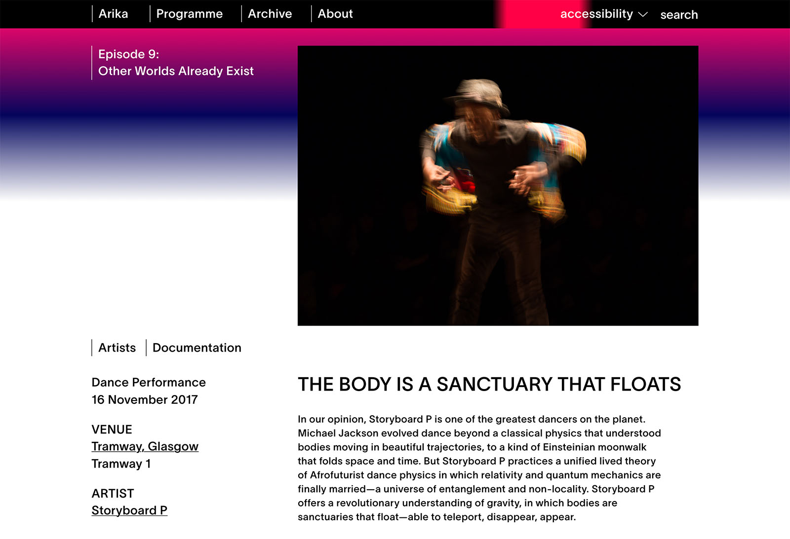
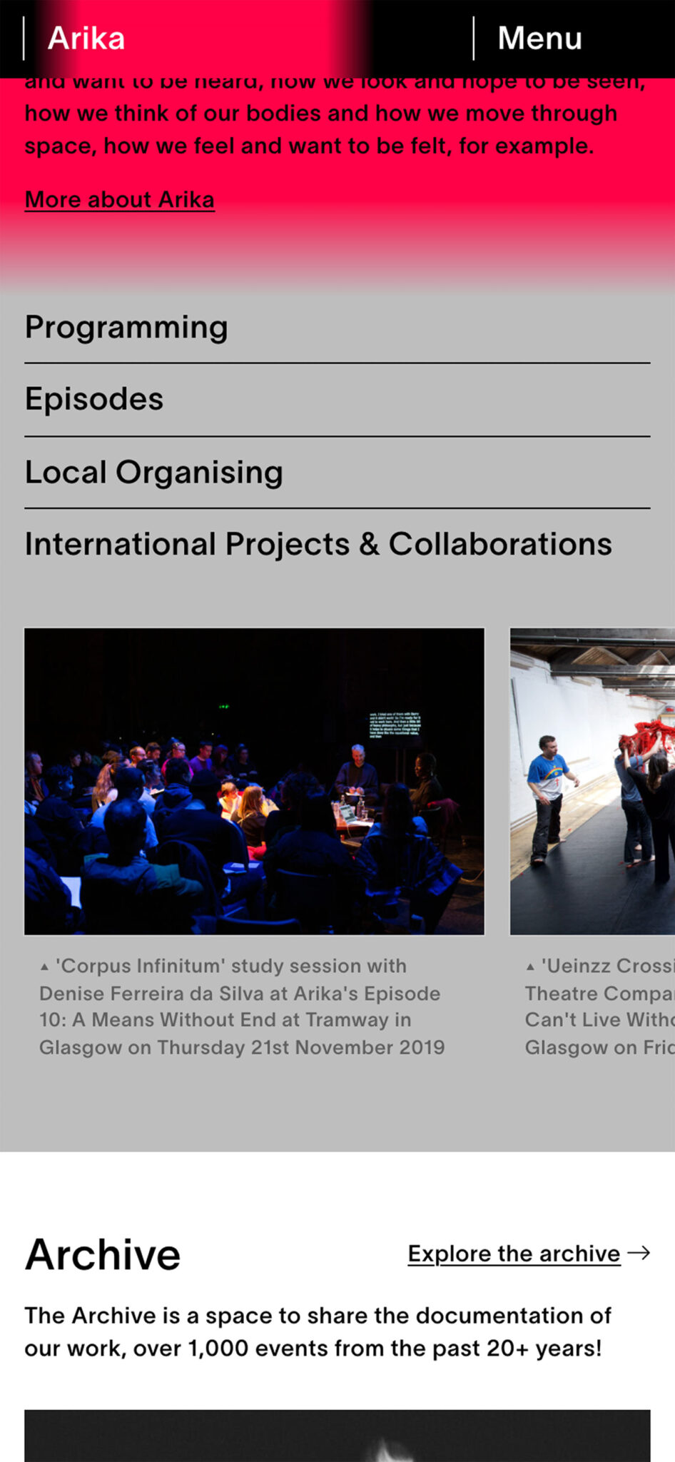
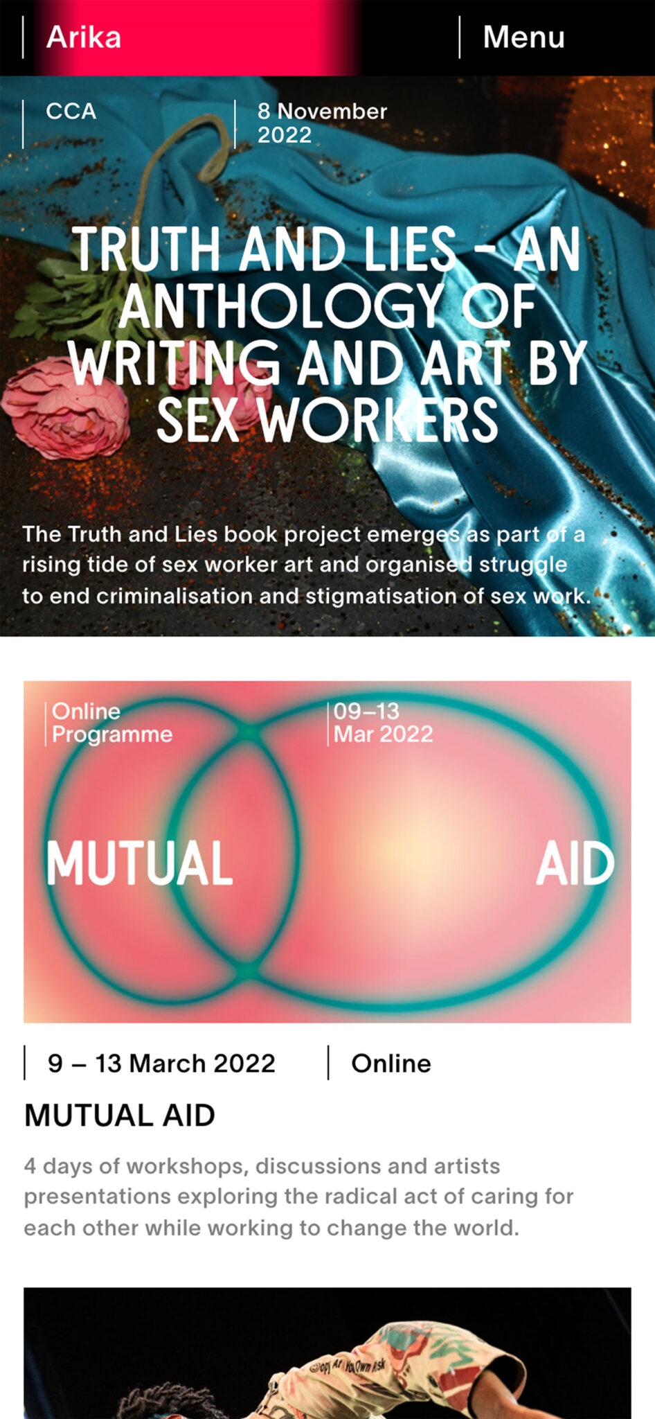
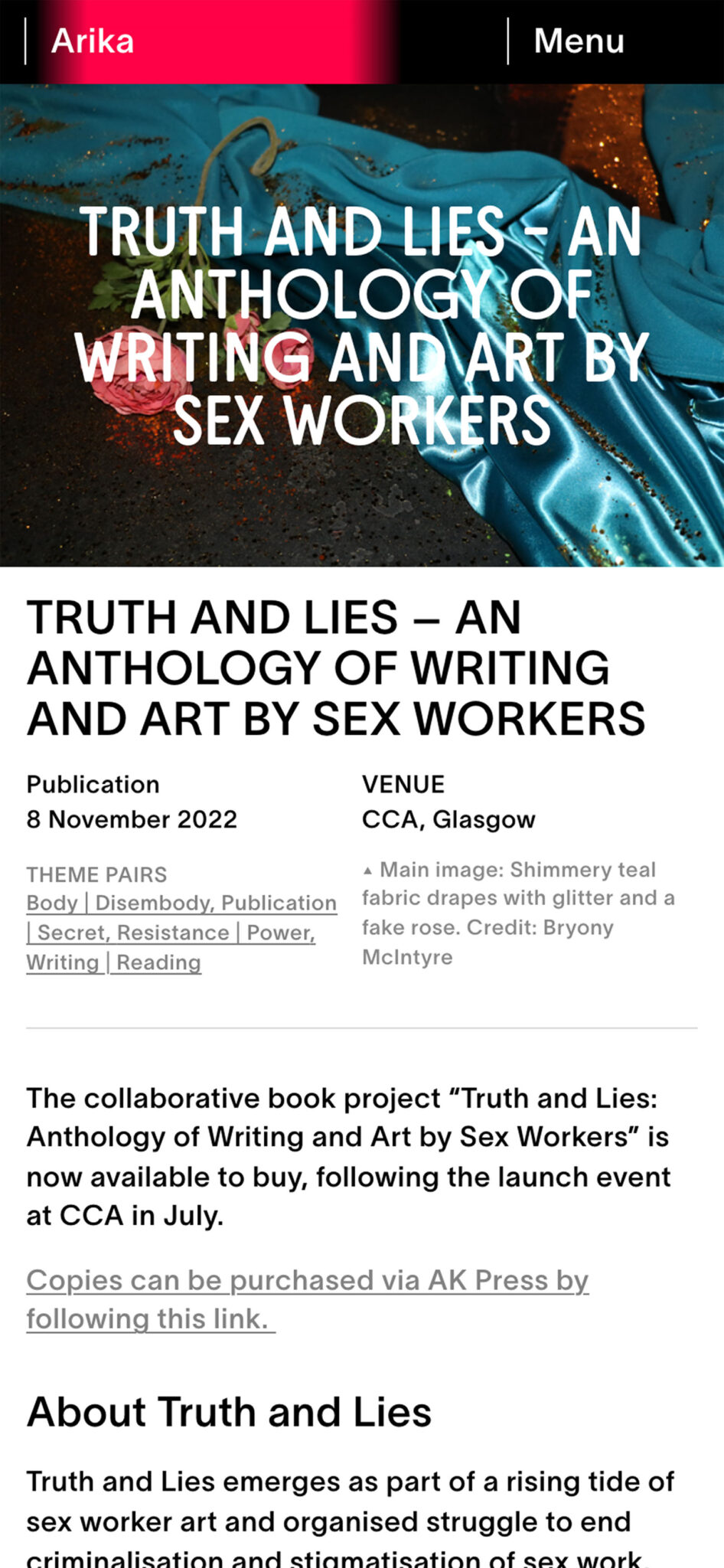
A redesign the website of political arts organisation Arika. The website has two main functions – to promote Arika’s upcoming and ongoing programme, and to serve as an archive of events dating back to 2001. Arika’s visual identity involves the use of high-contrast gradients in various configuration, which are integrated throughout the site. They are used to aid navigation and give structure to the event pages, and as banners when no other visual material yet exists. Given the highly diverse range of visual material on the site, they provide structure in a visually engaging way while leaving allowing the work to take prominence.
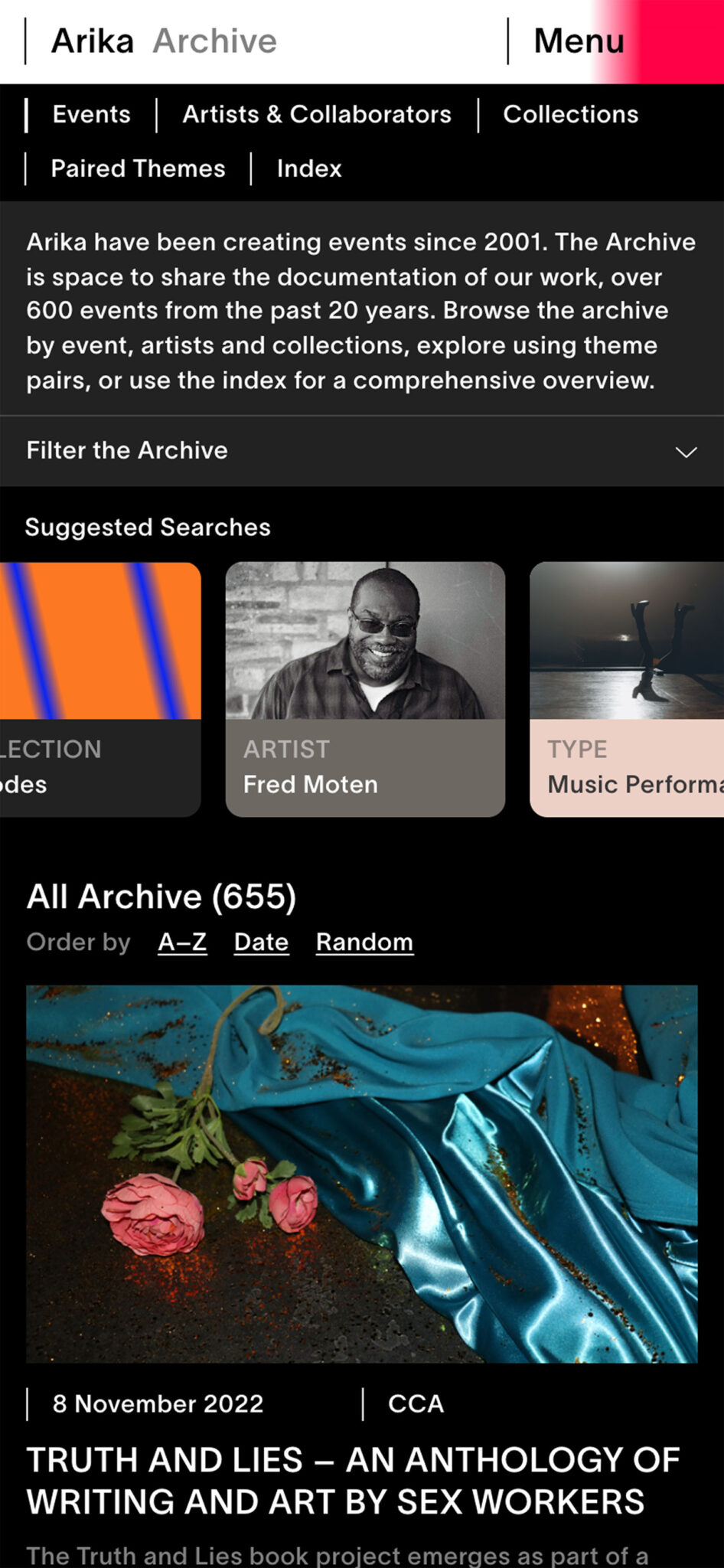
The content structure was developed to respond to Arika’s practice which often organises groups of events within an instance of a larger programme. The archive allows visitors to search and filter by programme, artist, theme, or type of work. Accessibility was a primary concern from the beginning. The site implements controls to accommodate requirements for type size, color, reading, and motion. Additionally, it reads pre-set browser configurations to automatically set any accessibility preferences the user may have already specified.
In collaboration with Maeve Redmond

Programme
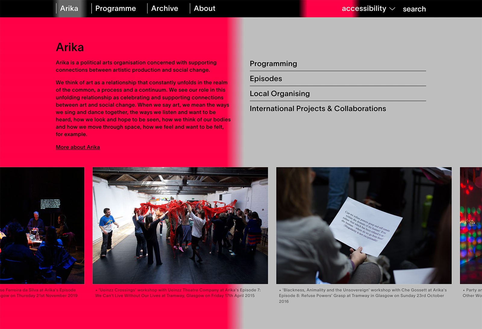
Gradients
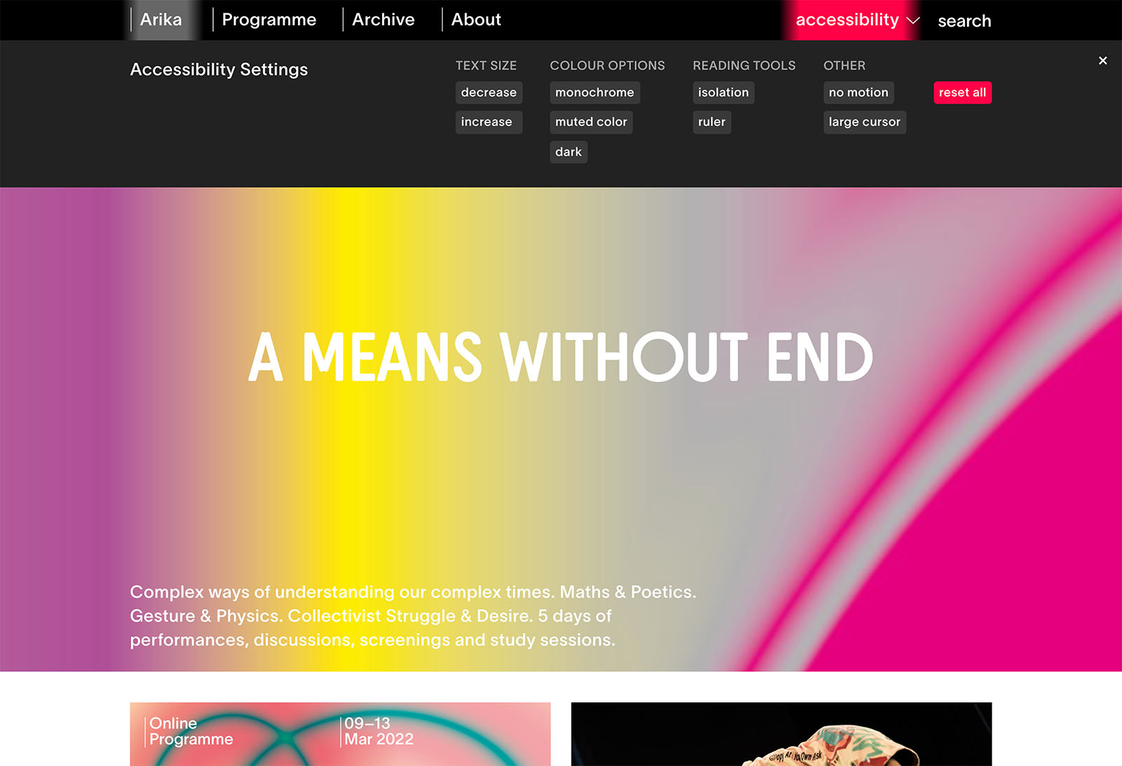
Accessibility
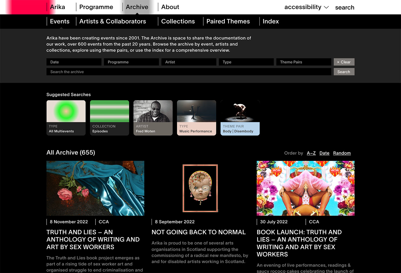
Archive
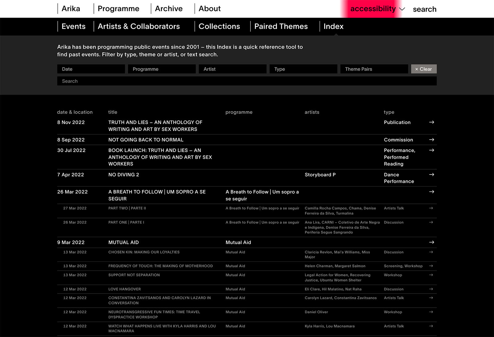
Index
